Navigation
This section contains the information on the following:
This section explains how to login to Aura and the general layout of the screen.
Logging In
To log in the Aura Platform,
1. Enter the URL in the Address bar of the browser.
2. Enter the User Name and the Password in the respective fields.
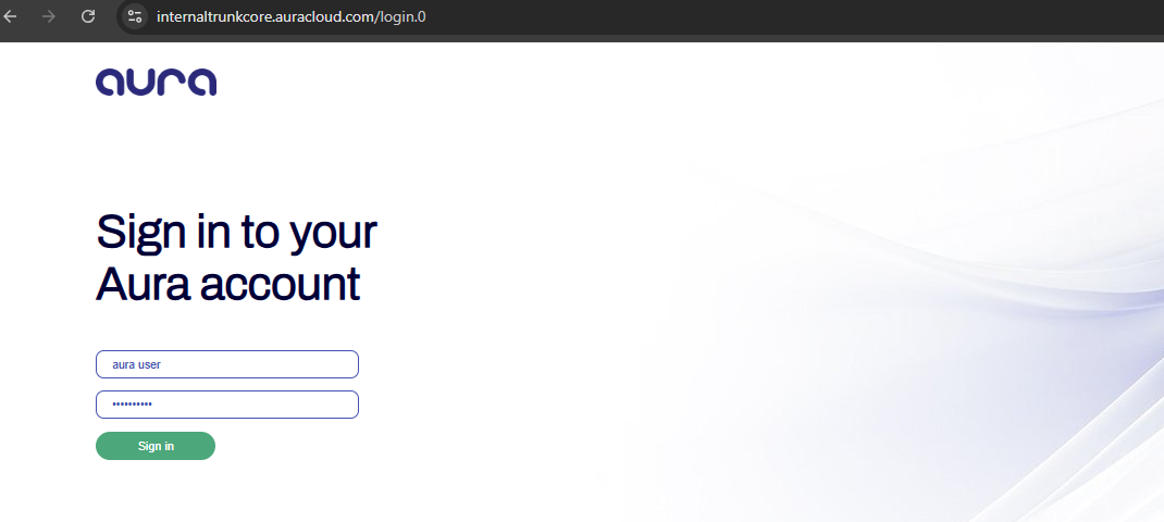
3. Click on the Sign in button. If Force password change field option is enabled while creating your user credentials, then the Change Password page will appear. Else, the Landing page will appear.
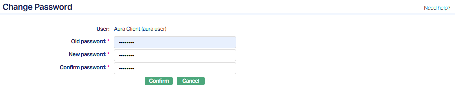
4. Enter the Old password.
5. Enter the New password.
6. Input the same password entered in the above final field to Confirm password.
7. Click Confirm. The Sign In screen will appear.
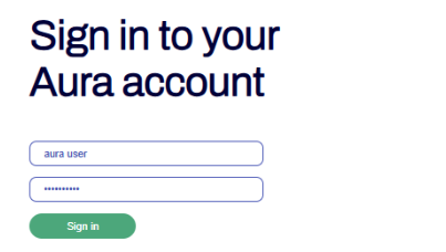
8. Enter the User name and the Password in the respective fields. The Landing page is displayed as shown below.
Landing page
Once a user successfully logs into Aura, the Landing Page is displayed. This screen acts as a dynamic workspace, providing quick access to key tasks, notifications, and communication tools through modular widgets, It is designed to offer a personalized overview of the user's current operational state.
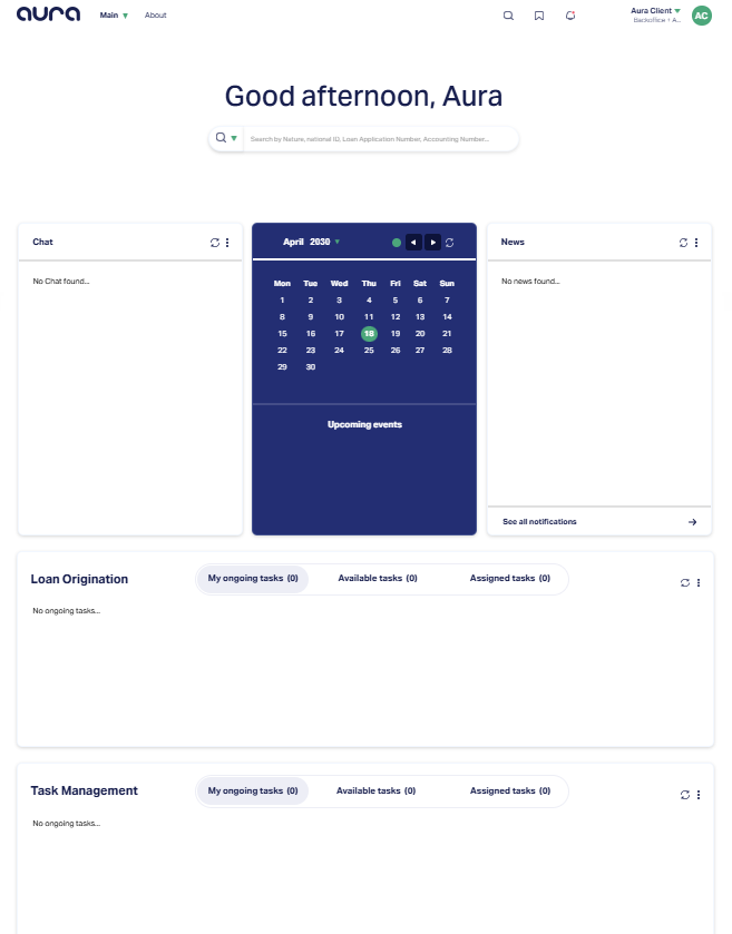
In order to describe all the components of a landing page, consider the screenshots given below:
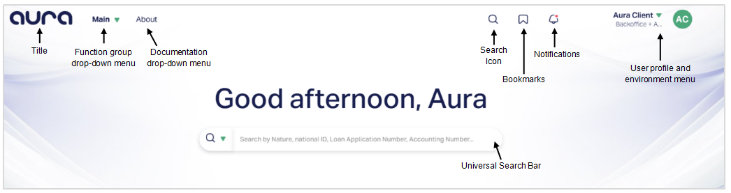
Aura Navigation - Top Bar Overview
The top navigation bar in Aura provides access to core modules, profile settings, and utilities across the platform.
1. Aura Logo (Title): The Aura Logo is displayed at the top-left corner of the screen. Clicking this logo will typically bring you back to the Landing Page, regardless of the module or function you are currently viewing.
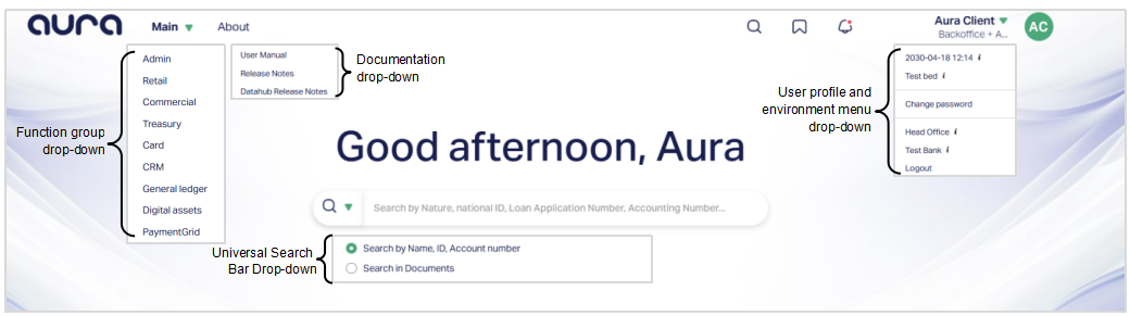
2. Main (Function group Drop-down menu): The main drop-down provides access to all core modules in the application, such as:
Admin
Retail
Commercial
Treasury
Card
CRM
General Ledger
Digital Assets
PaymentGrid
Once you click on a module from this list, the corresponding Function Group Menu and Function Menu are opened.
3. About (Documentation Drop-down menu): Clicking the About link opens a drop-down with links to:
User Manual
Release Notes
Datahub Release Notes
Here, all support and documentation resources are grouped together in section for easy access.
4. Universal Search Bar: Aura offers a unified global search bar prominently located on the Landing Page. It enables you to quickly locate records using a variety of identifiers without needing to navigate into specific modules or functions. The search bar supports multiple types of look-ups, making it a powerful entry point to access records across the platform. It's components are:
- Search Type selector (Drop-down Button) - Located on the left side of the bar, this drop-down allows you to choose what kind of information you want to search by.
5. Search Icon: Located at the top navigation bar (right side), the search icon offers another entry point to the search capability. This icon ensures that the search functionality is accessible from any screen, not just the Landing Page.
6. Bookmark Icon: This icon gives you access to a personalized list of bookmarked functions. When clicked:
It displays a list of screens or features you've pinned for quick access.
You can add or remove bookmarks based on your workflow needs.
This feature helps you organize frequently used tasks and navigate directly to them without going through menus.
7. Notification Icon: The Notification icon is located in the top-right corner of the Aura home page and is represented by a bell. This icon provides quick visibility into important system alerts and action-oriented messages that may require your attention.
When you click the Notification icon, Aura opens a drop-down panel that displays a list of notifications generated across different modules. Each notification highlights a specific condition, status change, or action pending in Aura. Selecting a notification redirects you to the relevant screen where you can review the details and take the required action.
Notifications in Aura are classified into Persistent and Transient notifications based on their purpose and visibility duration.
i) Persistent Notifications: Persistent Notifications remain visible under the Notification icon until the required action is completed. These notifications indicate mandatory actions or unresolved items that must be addressed to continue normal operations. Aura continues to display persistent notifications to ensure that critical tasks are not missed or overlooked. Once the required action is taken and the condition is resolved, the notification is automatically removed from the list. Examples of persistent notifications include - Unapproved records, Pending approvals, or mandatory setup actions.
Mandate Rejection Notification:
When a mandate linked to an agreement is rejected, Aura displays a Mandate Rejection notification under the Notification (bell) icon, provided the CBD date of the agreement is equal to or greater than 7 days. This notification helps you stay informed about rejected mandates without navigating to the Agreements screen manually.
If the CBD is less than 7 days, the mandate rejection notification is not displayed under the Notification icon.
When you click the Mandate Rejection notification, Aura redirects you to CRM → Clients → Agreement, where the rejected mandates are displayed for review. The notification remains visible until the underlying condition is resolved.
ii) Transient Notifications: Transient Notifications are informational or status-based alerts that remain visible under the Notification icons for a limited period, typically up to 7 days. These notifications do not require an immediate mandatory action but are displayed to keep you informed about important system events or changes. After the visibility period expires, transient notifications are automatically removed from the Notification list. Even after the notification is removed, the related records can still be accessed from the respective module screens.
8. Aura Client (User profile and environment menu drop-down): The Aura Client drop-down in the top-right corner provides access to session-specific and user profile actions. It displays:
Current login timestamp
Active environment or branch (e.g., Head Office, Test Bank)
Option to change your password
Option to switch between environments or entities
Logout option
This menu keeps your session controls organized and accessible in one place, allowing you to manage user preferences and switch work contexts easily.
Aura Navigation - Center Panel Widgets
The center section of the Aura Landing Page contains three important widgets arranged side-by-side:
- Chat
- Calendar
- News
These panels provide real-time visibility into user communication, scheduled events, and system-wide updates.
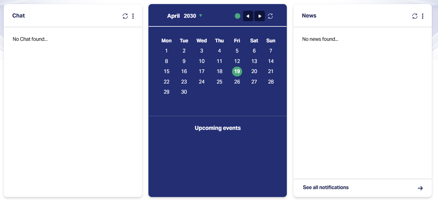
1. Chat Panel: The chat panel displays recent system-generated messages or direct communications relevant to the logged-in user. Messages are listed in chronological order, displaying - Sender initials, Message preview and then timestamp.
If no conversations are available, the widget displays: "No Chat found..."
Controls:
Refresh icon: Reloads the message list to fetch recent messages.
Options menu: Selecting this menu opens the Conversations screen located at CRM > Conversations.
2. Calendar Panel: Displays the current month in a calendar format, allowing you to view and track scheduled or system-triggered events. The widget highlights - Current month and year, Today's date (marked with a green circular indicator) and Upcoming events section (if any are scheduled).
Controls:
Left / Right Arrows: Navigate to the previous or next month.
Today Button (●): Return to the current date.
Refresh Icon: Update the calendar with the latest data.
Events shown in this panel are typically tied to workflows, due dates, or assigned system tasks. If there are no upcoming events, the widget will display the message: Upcoming events (with no content listed underneath.
3. News Panel: The News panel displays system-wide announcements or platform-related updates configured by administrators. When there are no active announcements, the widget displays: "No News found...". Announcements, when available, are shown in a list of format with brief summaries.
You can click "See all notifications →" to view the full list of notifications in a detailed view.
Controls:
Refresh Icon: Reloads the widget to check for newly posted announcements.
Options menu: Clicking this opens the Announcement screen, where you can view all current or historical announcements based on date filters.
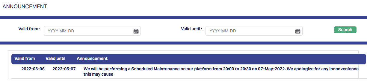
This screen provides a date-based filter to view platform announcements published within a specific period. The fields that are shown are:
Valid from: Start date of the announcement (uses calendar picker)
Valid until: End date of the announcement (uses calendar picker)
Search: Button used to retrieve announcements within the specified date range.
Results table
Displays the announcement details in a tabular format with the following columns:
Valid from: Start date of announcement visibility.
Valid until: Expiry date of the announcement.
Announcement: Main message or content of the notice.
If there are no announcements within the selected period, the table displays: "No records found...".
Aura Navigation - Loan Origination Widget
The Loan Origination panel on the Landing Page provides quick access to tasks related to loan processing. It contains three sub-tabs:
- My ongoing tasks
- Available tasks
- Assigned tasks
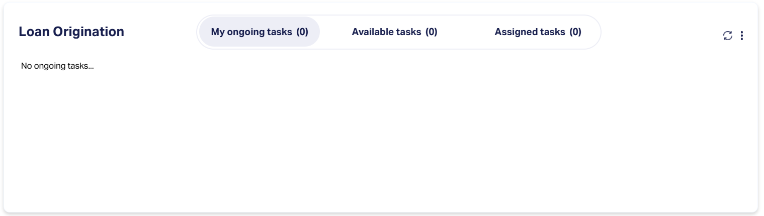
Note: Although the task list content changes for each tab, the layout and controls remain consistent.
Aura Navigation - Loan Origination
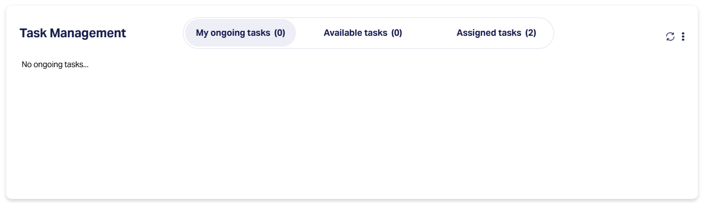
The Tasks Panel in the center section of the Landing Page displays tasks in three separate tabs: My Ongoing Tasks, Available Tasks, and Assigned Tasks.
1. My Ongoing Tasks
The My Ongoing Tasks tab displays tasks that you have already started but have not yet completed. These tasks remain in this tab until they are processed and marked as complete.
The tab displays a table containing the following columns:
| Column | Description |
|---|---|
| Person / Org ID | Unique identification number of the individual or organization related to the task. |
| Name | Displays the full name of the individual or organization. |
| Process | Indicates the business process the tasks belong to e.g., Consumer Loan Origination. |
| Action | Specifies the task type or required action, e.g., Backoffice Task |
| Follow up date | The date by which the task needs to be reviewed or completed. |
If there are no ongoing tasks, the tab will display the message "No ongoing tasks...".
Each record has an Actions menu (displayed as a numbered button), providing options to manage the task.
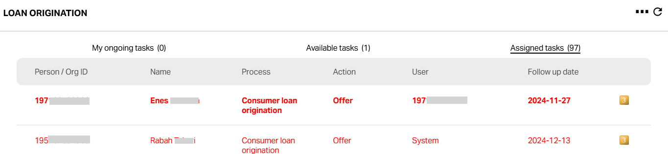
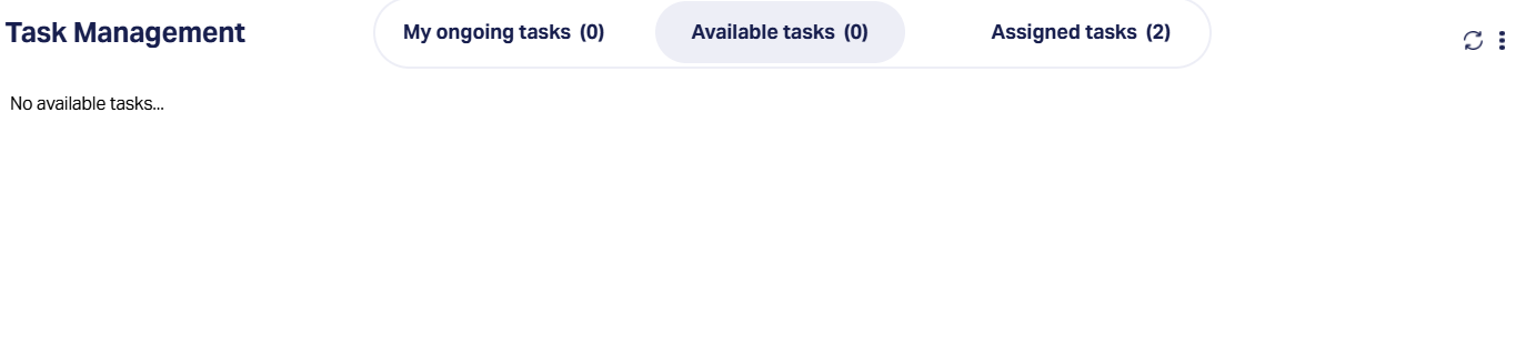
2. Available Tasks
The Available Tasks tab lists tasks that are unassigned but ready to be picked up and processed.
These tasks are available to any user with the necessary permissions and remain here until someone starts them.
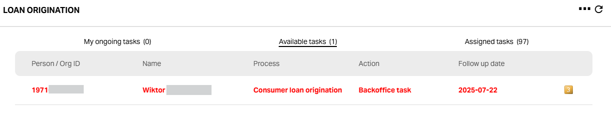
The tab displays a table containing the following columns:
| Column | Description |
|---|---|
| Person / Org ID | Unique identification number of the individual or organization related to the task. |
| Name | Displays the full name of the individual or organization. |
| Process | Indicates the business process the tasks belong to e.g., Consumer Loan Origination. |
| Action | Specifies the task type or required action, e.g., Backoffice Task |
| Follow up date | The date by which the task needs to be reviewed or completed. |
Action Menu: A yellow numbered icon indicating task options. The number's meaning is system-specific. Clicking it opens two options : Process and View
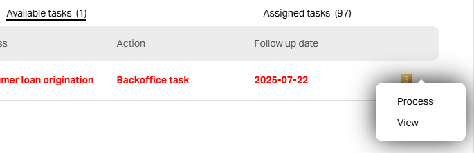
Process:
1. Selecting Process opens the Overdue Reason screen where you can log the reason for delay or pending action before proceeding.
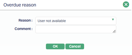
2. The screen contains:
Reason - A drop-down menu to select the reason (e.g., User not available)
Comment - An optional text field to provide further explanation or notes.
3. Click OK to confirm and proceed, or Cancel to close without saving.
View:
Selecting View opens the detailed Customer Loan Origination screen in a read-only mode displaying:
Application Details - Includes SSN, name, contact information, applied amount, approved amount, interest rate, tenor, application ID, and loan account number.
Backoffice Decision - Shows the decision outcome and, if applicable, the rejection reason.
Internal Notes - Lists any dated internal remarks for the application.
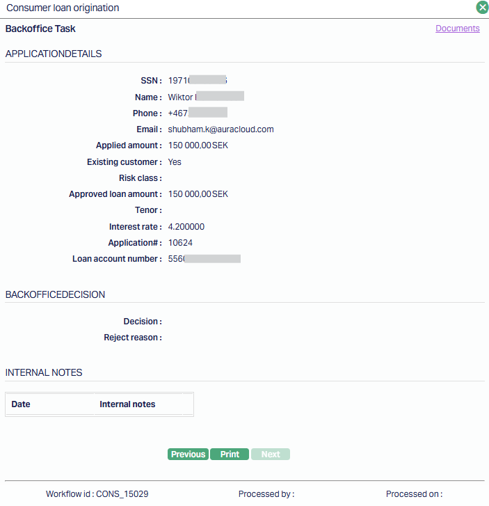
Additional controls include Previous, Next, and Print buttons, along with a link to view related Documents. This option is used for reviewing complete application details without making changes.
4 . Assigned Tasks:
The assigned Tasks tab displays all tasks that have been assigned to you or other users but are not yet completed.
The tab displays a table containing the following columns:
| Column | Description |
|---|---|
| Person / Org ID | Unique identification number of the individual or organization related to the task. |
| Name | Displays the full name of the individual or organization. |
| Process | Indicates the business process the tasks belong to e.g., Consumer Loan Origination. |
| Action | Specifies the task type or required action, e.g., Backoffice Task |
| User | The user the particular task is assigned to. |
| Follow up date | The date by which the task needs to be reviewed or completed. |
Action Menu: A yellow numbered icon indicating task options. The number's meaning is system-specific. Clicking it opens two options: Assign or View
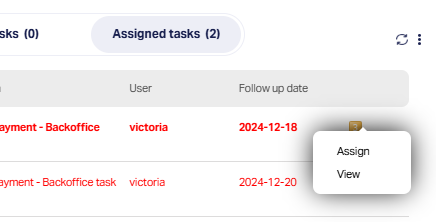
Assign:
1. Selecting Assign opens the Assign Task screen, where you can reassign the selected task to another user or move it back to the pool of available tasks.
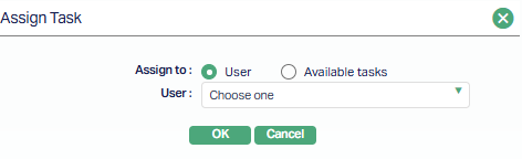
2. The screen contains the following controls:
Assign to - Radio button to choose between:
User - Enables the User drop-down field, allowing you to select a specific user from the list.
Available tasks - Disables the User drop-down, returning the task to the unassigned Available Tasks list.
User - A drop-down menu listing all eligible users (enabled only when user is selected.
3. Once the selection is made, click OK to save changes or Cancel to exit without making changes.
View:
Selecting View opens the detailed task screen for the selected item in a read-only mode.
The fields and layout depend on the type of task:
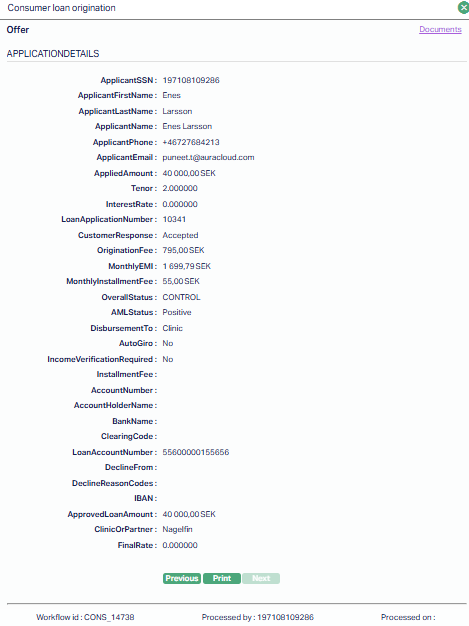
- Offer - Displays the Consumer Loan Origination -- Offer screen, which includes comprehensive applicant details (name, SSN, contact details), loan application number, applied and approved amounts, applicable fees, EMI details, AML status, disbursement method, and other loan parameters.
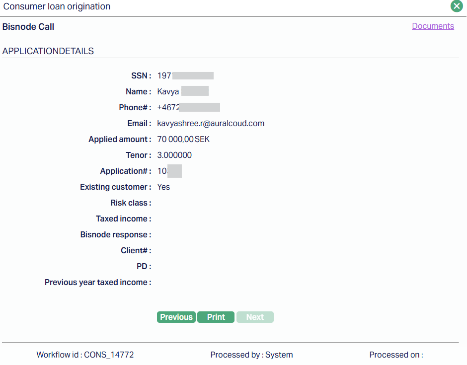
- Bisnode Call - Displays the Consumer Loan Origination -- Bisnode Call screen, showing applicant details, applied amount, tenor, application number, existing customer status, risk class, taxed income, Bisnode response, client number, PD, and previous year's taxed income.
Both views include sections for internal notes, navigation buttons (Previous, Next), a Print option, and a link to related documents.
No changes can be made from this view; it is intended solely for reviewing the full task details.
Loan Origination - Common Layout and Controls:
When you click the three-dot menu on any sub-tab -- My ongoing tasks, Available tasks or Assigned tasks -- a search and filter panel opens.
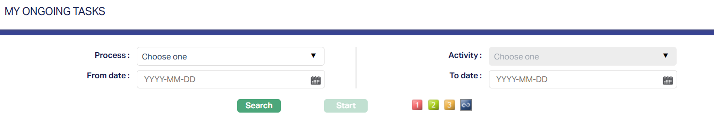
Filter Fields
Process - Drop-down to select the relevant process (e.g., Consumer Loan Origination, Account Opening)
From Date - Date picker to select the starting date for the search period.
Activity - Drop-down to filter by specific activity type.
To Date - Date picker to select the ending date for the search period.
Buttons
Search - Applies the selected filters and displays matching tasks.
Start - Initiates processing for the selected task (only enabled when a task is highlighted in the list.)
Priority Filters -
Coloured number buttons indicate and filter tasks by priority:
1 (Red) - High priority
2 (Yellow) - Medium priority
3 (Green) - Low priority
∞ (Blue) - All priorities
Aura Navigation - Task Management Widget
The Task Management screen displays all tasks that you have permission to view or manage, regardless of their process type. The interface is divided into three tabs -
- My ongoing tasks
- Available tasks
- Assigned tasks.
Note: Although the task list content changes for each tab, the layout and controls remain consistent.
Aura Navigation -Task Management
The Tasks Panel in the center section of the Landing Page displays tasks in three separate tabs - My Ongoing Tasks, Available Tasks and Assigned Tasks.
1. My Ongoing Tasks
The My Ongoing Tasks tab displays tasks that you have already started but have not yet completed. These tasks remain in this tab until they are processed and marked as complete.
The tab displays a table containing the following columns:
| Column | Description |
|---|---|
| Person / Org ID | Unique identification number of the individual or organization related to the task. |
| Name | Displays the full name of the individual or organization. |
| Process | Indicates the business process the tasks belong to e.g., Consumer Loan Origination. |
| Action | Specifies the task type or required action, e.g., Backoffice Task |
| Follow up date | The date by which the task needs to be reviewed or completed. |
If there are no ongoing tasks, the tab will display the message "No ongoing tasks...".
Each record has an Actions menu (displayed as a numbered button), providing options to manage the task.
2. Available Tasks
The Available Tasks tab lists tasks that are unassigned but ready to be picked up and processed.
These tasks are available to any user with the necessary permissions and remain here until someone starts them.
The tab displays a table containing the following columns:
| Column | Description |
|---|---|
| Person / Org ID | Unique identification number of the individual or organization related to the task. |
| Name | Displays the full name of the individual or organization. |
| Process | Indicates the business process the tasks belong to e.g., Consumer Loan Origination. |
| Action | Specifies the task type or required action, e.g., Backoffice Task |
| Follow up date | The date by which the task needs to be reviewed or completed. |
Action Menu: A yellow numbered icon indicating task options. The number's meaning is system-specific.
3. Assigned Tasks:
The assigned Tasks tab displays all tasks that have been assigned to you or other users but are not yet completed.
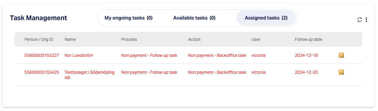
The tab displays a table containing the following columns:
| Column | Description |
|---|---|
| Person / Org ID | Unique identification number of the individual or organization related to the task. |
| Name | Displays the full name of the individual or organization. |
| Process | Indicates the business process the tasks belong to e.g., Consumer Loan Origination. |
| Action | Specifies the task type or required action, e.g., Backoffice Task |
| User | The user the particular task is assigned to. |
| Follow up date | The date by which the task needs to be reviewed or completed. |
Action Menu: A yellow numbered icon indicating task options. The number's meaning is system-specific. Clicking it opens two options: Assign or View
Assign:
4. Selecting Assign opens the Assign Task screen, where you can reassign the selected task to another user or move it back to the pool of available tasks.
5. The screen contains the following controls:
Assign to - Radio button to choose between:
User - Enables the User drop-down field, allowing you to select a specific user from the list.
Available tasks - Disables the User drop-down, returning the task to the unassigned Available Tasks list.
User - A drop-down menu listing all eligible users (enabled only when user is selected.
6. Once the selection is made, click OK to save changes or Cancel to exit without making changes.
View:
Selecting View opens the detailed task screen for the selected item in a read-only mode.
It displays key overdue account details such as account number, customer name, overdue status and duration, overdue start date, total overdue amount, and current balance.
The Notes section lists dated comments from previous follow-ups, while the Documents link provides access to any related attachments.
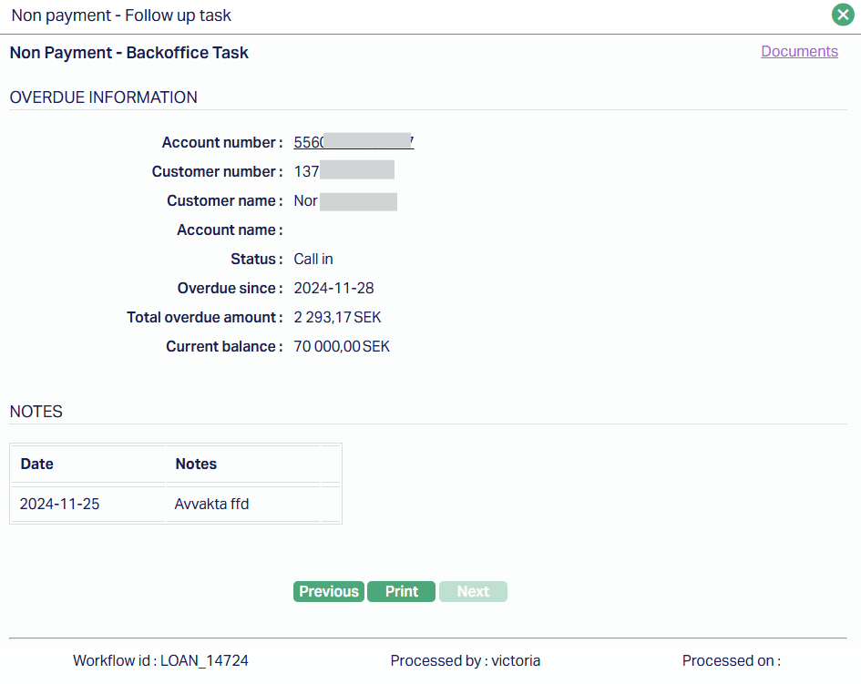
Navigation buttons (Previous, Next) let you move between tasks, and Print allows you to generate a copy of the details.
No changes can be made from this view; it is intended solely for reviewing the full task details.
Task Management - Common Layout and Controls:
When you click the three-dot menu on any sub-tab -- My ongoing tasks, Available tasks or Assigned tasks -- a search and filter panel opens.
Filter Fields
Process - Drop-down to select the relevant process (e.g., Consumer Loan Origination, Account Opening)
From Date - Date picker to select the starting date for the search period.
Activity - Drop-down to filter by specific activity type.
To Date - Date picker to select the ending date for the search period.
Buttons
Search - Applies the selected filters and displays matching tasks.
Start - Initiates processing for the selected task (only enabled when a task is highlighted in the list.)
Priority Filters -
Coloured number buttons indicate and filter tasks by priority:
1 (Red) - High priority
2 (Yellow) - Medium priority
3 (Green) - Low priority
∞ (Blue) - All priorities
Generic Search
When you access any of the Functions available in Aura, corresponding Search page will be displayed. In general, the Search Page has the following features:
Search For: This gives a list of drop-down options which can be used as the search criterion. Depending on the search criterion chosen, the next field shows a text box or a drop-down list.
If the criterion chosen has Pre-shipped options, the next field becomes a dropdown list showing the list of pre-shipped options
If the criterion chosen is a date, the next field becomes a text box with a calendar option to choose the required date from
If the criterion is any other, the next field becomes a text box where you can input the required text.
Search: A click on this button will retrieve search results based on the criterion and value input in the Search For and text box fields.
All: A click on this button will erase any search criterion earlier input and will retrieve all records existing in Aura.
Note:
If there are no records matching the search criterion, Aura will display a message to this effect.
If records do exist, these are displayed as a summary list, with the total count at the bottom of the page.
When the number of records is more than 25, Aura automatically creates multiple pages showing a maximum of 25 records in each page.
To move between pages, you can click on the pagination provided on the right bottom corner of the page. A click on:
>> will take to the last page.
<< will take to the first page.
> will take to the next page.
< will take to previous page.
To view details of any specific record, click on the record.
Maintain Card account is the Function considered here to explain on how the Search function can be used.
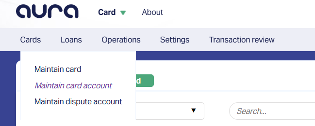
1. Access the Maintain card account Function available at Card > Cards. The Card Account Search page will be displayed.
2. Click All. All the card accounts maintained in Aura will be listed here.
3. Select the option from Search drop-down list based on which Aura can filter and display the search results. The options available in the Search drop-down list are:
Account # : denotes the account number.
Account name: denotes the name of the account.
Account status: denotes the current status of the account.
Branch: denotes the name of the branch for which the account is created.
Client #: denotes the auto generated client number.
Client name: denotes the name of the account holder.
Currency: denotes the transaction currency of the account.
Payment status: denotes the current payment statuses of the account.
Product: denotes the name of the product for which the account is created.
4. Based on the Search for option selected, enter the corresponding value in the text field next to the drop-down list.
5. Click Search. The search result based on the search criteria entered will be displayed.
Viewing summary and details
This section explains how the content is segregated and displayed on the View screen in Aura.
Maintain Card Account is the Function considered here to explain on how to view the summary and details of a record.
1. Access the Maintain card account Function available at Card > Cards. The Card Account search page will be displayed.
2. Click All. All the card accounts maintained in Aura will be listed as shown in the above screen.
3. Click on the required record to view details. Card Account Maintenance page will be displayed.
The components available in the Card Account Maintenance page are:
- Tabs: The different tabs available under any Function will be displayed in the view page. When you click on the tabs the corresponding data under that tab are displayed.
The data in any View screen in Aura is generally segregated into three sections:
Header: The header section will contain the basic information such as Client name, Client number, Account number, Product name, Currency and Status.
Details: This section will show the detailed information about the Function as relevant to the Tab such as Account status details, Preferences set for the account and audit log.
Summary: The Summary section displays the summary/history of the records shown in the Details section.
Note:
Bubble in the Tab heading: Any critical actions handled in Aura application such as Account activation, Loan sanction or GL postings has to go through the Approval process. If there is any Approval pending under any of the tabs, this will be indicated by a bubble.
Audit Trail in Details Section: You can click on this icon to view the Audit Trail (Change Log) details.
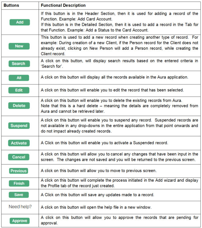
Common Action Buttons
The following table explains a few of the common buttons that you will find in Aura: